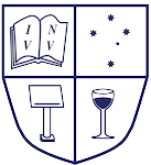
Background to the Current logo
In 2000, when Monash University administration decided that the blue and gold “Southern Cross and arch” logo was no longer appropriate for a global university, MAD was compelled to update its then logo – not only because it was based on the obsolete design, but also because it breached copyright by adapting the University’s logo to become its own. MAD was advised that it was welcome to make use of the University’s new logo, but the large blue rectangle with “MONASH UNIVERSITY” spelt out in capital letters wasn’t particularly inspiring and representative of the dynamics of the University’s most active and successful student club.
Designed by…
So, due to the lack of creative talent on the Executive, MAD commissioned a Logo Competition back in May 2000. We actually had an entry, and indeed a winner. Long-term MAD member Dan Celm designed the above crest, and, after undergoing a tough selection process, Dan’s logo was short-listed and presented to the MAD Executive for approval. Needless to say, the new logo was chosen for its representativeness of the club and its dynamics. It dons a nouveau classic and professional look to all MAD publications (on which it is meant to appear!). Thanks to his winning entry, Dan and a friend attended the smashing Annual Dinner courtesy of MAD.
What it means
The previous logo
Wasn’t it just beautiful?
Myles Tooher, who wrote this page, was MAD’s director of Sponsorship and Publicity in 2000. Myles commissioned the logo competition and is responsible for the poor digitisation of the originally hand-drawn logo.


